Our client needed to develop a new brand from a holistic perspective including packaging design, brand IP imagery, package design, and product formula. Our team conducted research on the market and user workshops to identify key drivers for the new brand.
During consumer research, we found that bright colors and gaming characters are some of the key visual drivers. In addition, the package structure needed to be changed to minimize spills and improve the user experience.
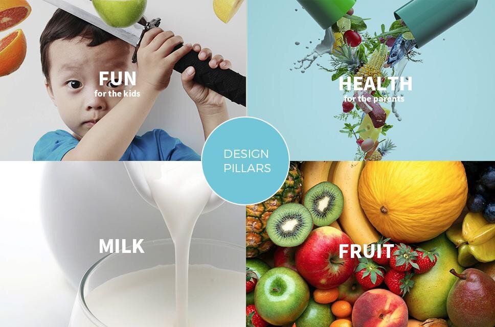
Using the insights and fun, health, milk, and fruit as the design pillars we developed the "little Q" monster series. The different Q characters corresponded to different fruit flavors. Finally, we changed the packaging into a more user friendly but yet cost-effective solution.
As a result of the new design and packaging, the jelly became a top-five selling product for the client.


